The launch of a new corporate strategy is the best time to bring in a fresh look to a brand. This was happening while I was mid-way through Nacro’s corporate website redevelopment earlier this year. The website specification called for a bold approach to the visual look of the new website, to set it apart from the competition. The UX designer in the agency I had hired, Moove, proposed a series of large images or photos on the home page and each main section that could ‘tell the story’ of a complex organisation simply.
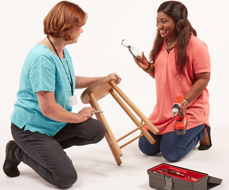
This tied in very well with the strategic requirements, and our small in-house team developed a photoshoot that would encapsulate each area of work through a series of scenarios. To cut costs and involve the wider organisation more closely in the brand work, staff were coordinated to play the roles of various people that Nacro helps, and the staff who help them.
It was clear to the in-house designer and me that we would require an exceptional photographer to carry out the staging and get the best from the non-professional models. Due to our development of a precise vision for the look and feel through a series of storyboards and design mockups, we were able to interest a top photographer from the advertising world. By means of incredibly coordinated administration from within the organisation, the filming was compressed into a tight timescale.
The result was two great photoshoots in one: a series of side-on images that set the tone for the new website and overhead shots for printed strategy material. The team effort involved so many people that it helped sell in the new look to the organisation as a whole.
