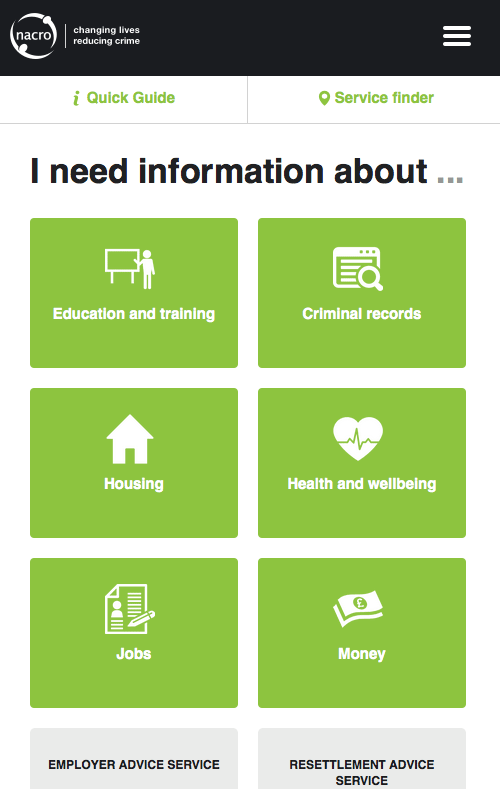
Nacro’s new corporate website is mobile first. I commissioned it this way as it’s the predominant method by which key audiences search for information.
Pre-development research showed that the people Nacro helps, many of whom are socially excluded, often only get online while in Nacro’s services and so are also likely to access its information through a tablet.
The format lends itself to tabs and icons, which also proved easy to use for all audiences during user consultation. There is a lot of work involved in honing the icons correctly.
These also prove very social media friendly as part of a multimedia approach to content sharing.
